Rain drops don’t stand a chance
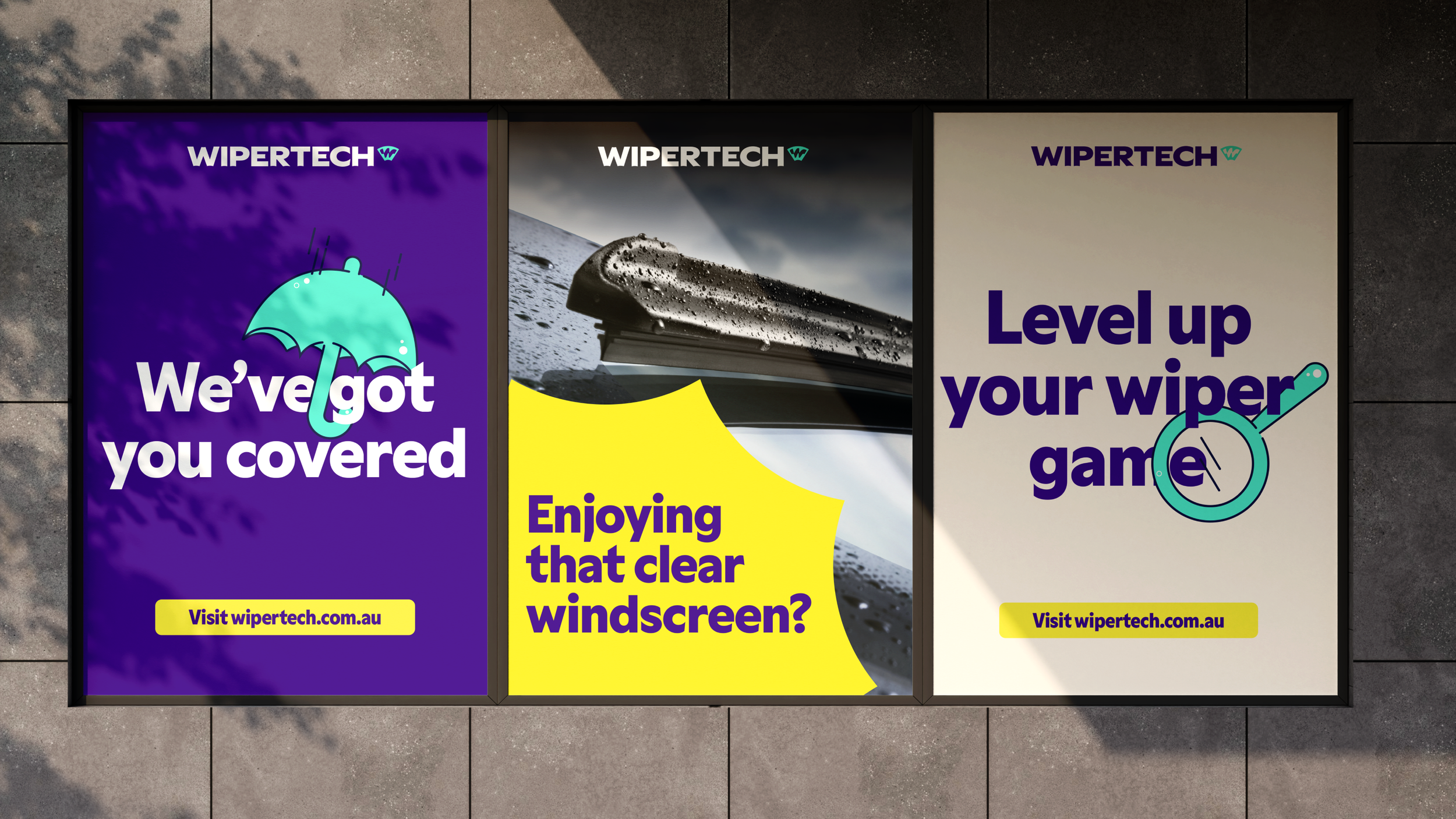
The world of automotive consumables, particularly wiper blades, has long been characterised by mundane necessity, perceived complexity and inflated costs. Wipertech emerged as a disruptive force, seeking a revitalised brand strategy and visual identity to challenge these entrenched perceptions and empower vehicle owners. Strategically positioned as the superior, smarter way, the brand captures the essence of ease, affordability and practical self-sufficiency.
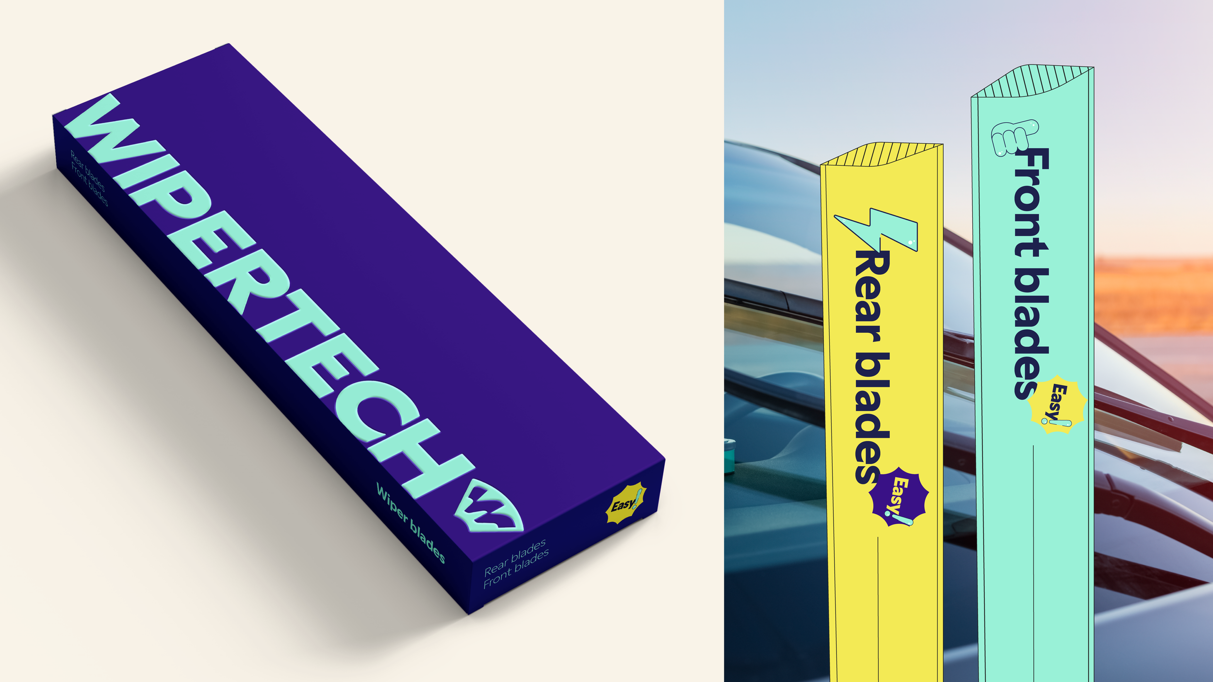
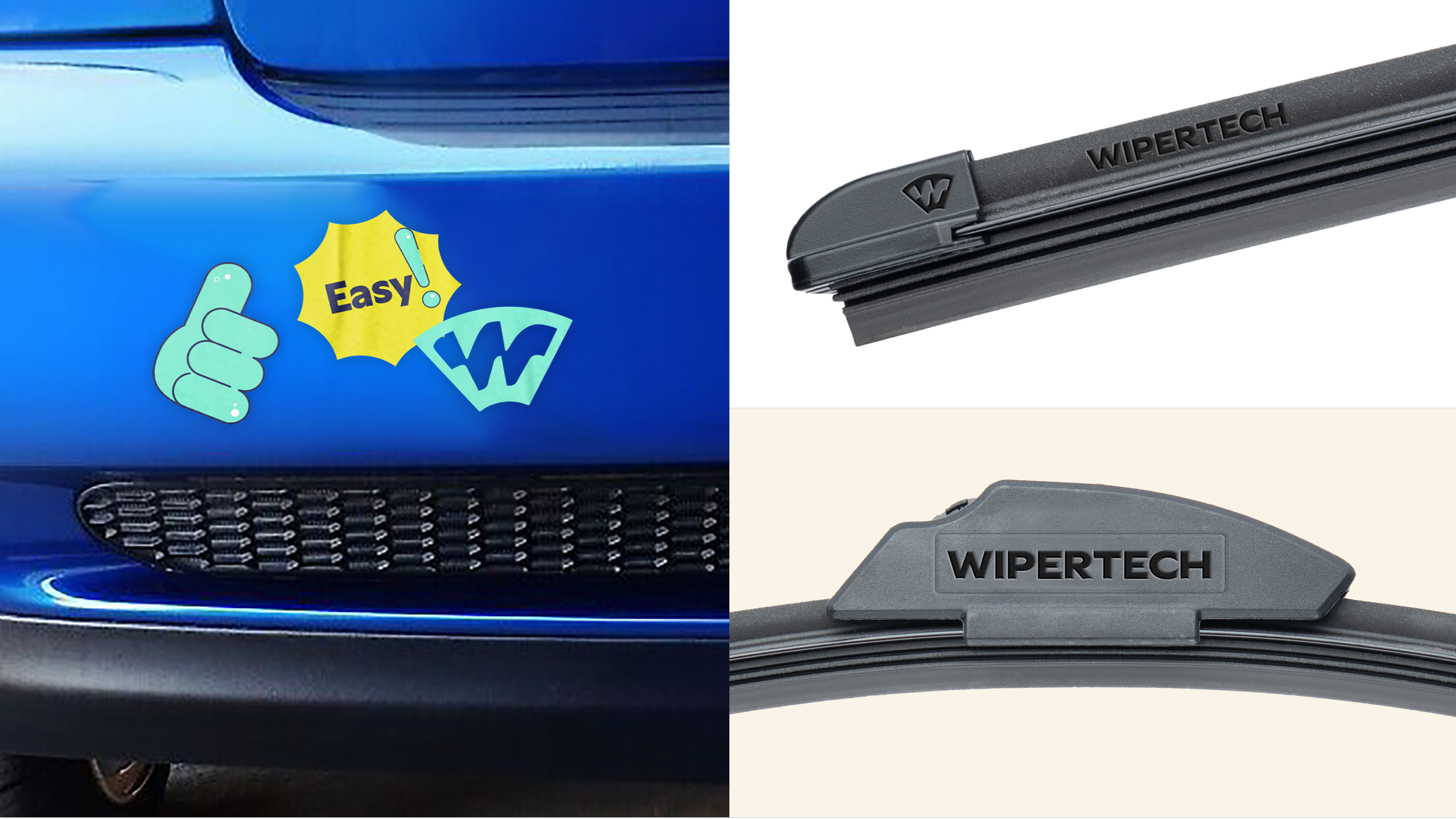
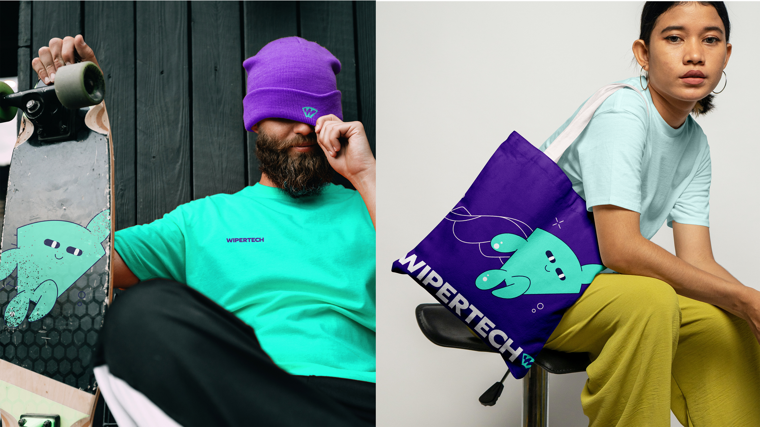
Balancing existing equities, the shield-shaped symbol conveys strength, security and ultimate protection, with the internal ‘W’ mimicking a wiping action to signal flow and technical precision, all rendered with a progressive and modern aesthetic. Shifting from a tedious chore to an engaging act, the brand system is further defined by its ultimate wiper hero mascot. This distinctive asset represents premium performance and a friendly guide, embodying the brand’s commitment to saving the day from streaks, rain and overspending, becoming a central figure in fun, educational communications.
The identity transforms a boring category into a cult favourite, and helps to create a nation of confident, clear-sighted drivers.
Client
Wipertech
We think business
Stakeholder engagement
Business model analysis
Value propositions
Product guardrails
We orchestrate brand
Brand platform, Brand identity, Mascot creation, Brand voice, Brand messaging, Brand guidelines, Brand application