The pulse that powers pickleball
What began as a backyard game with two paddles, a ball and some tape has grown into one of Australia’s fastest-rising sports, bringing together players of all ages and abilities.
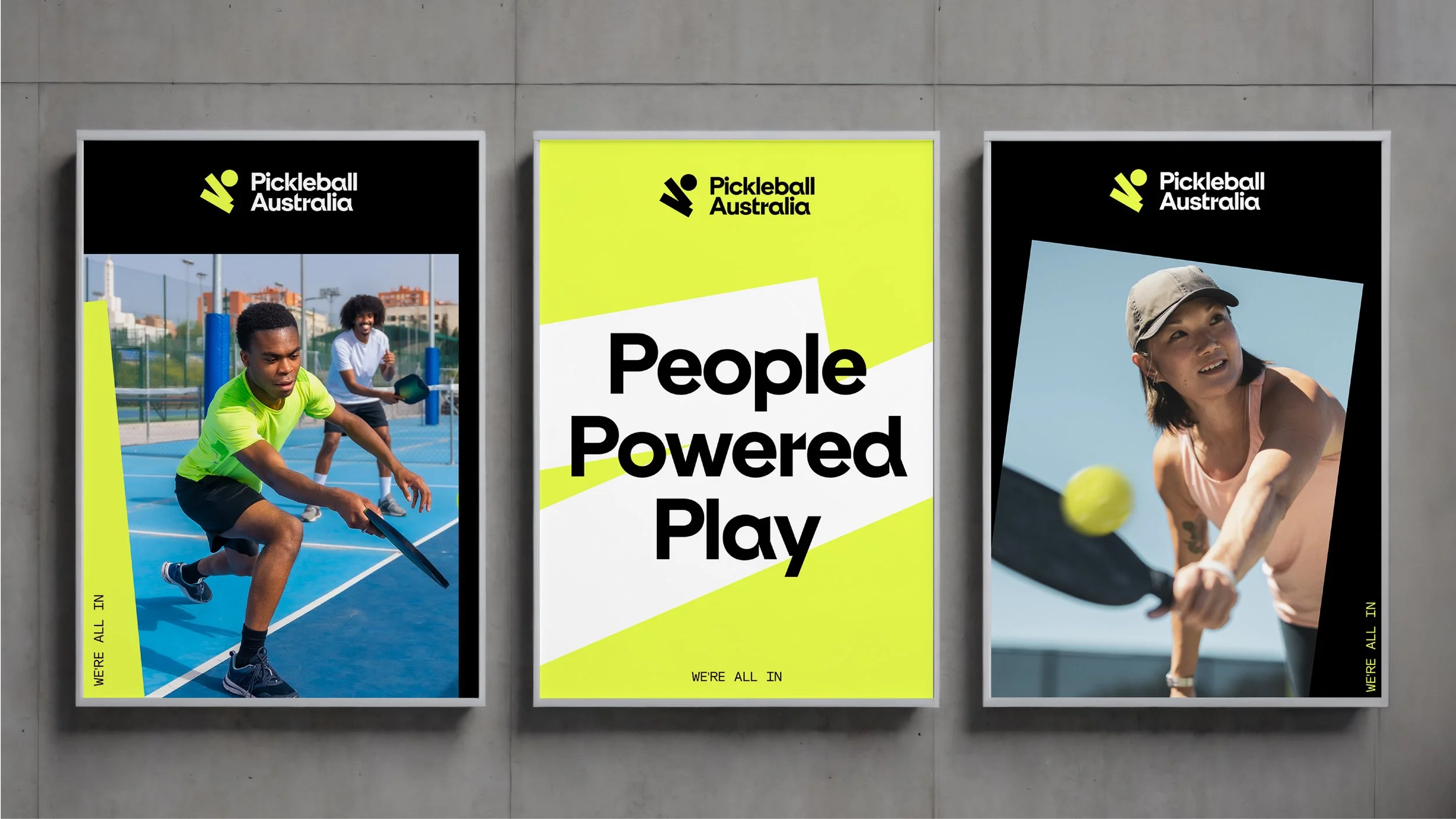
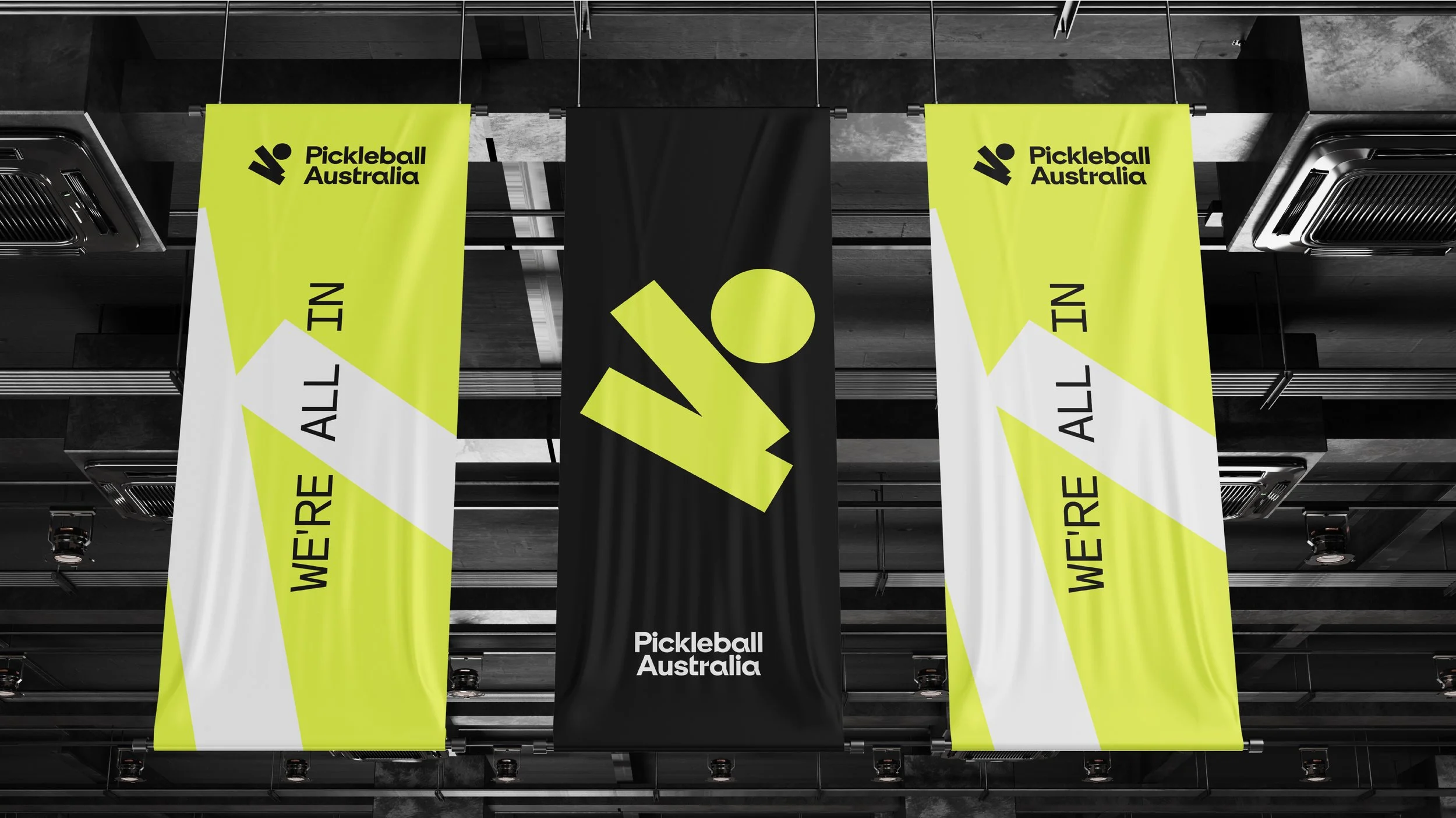
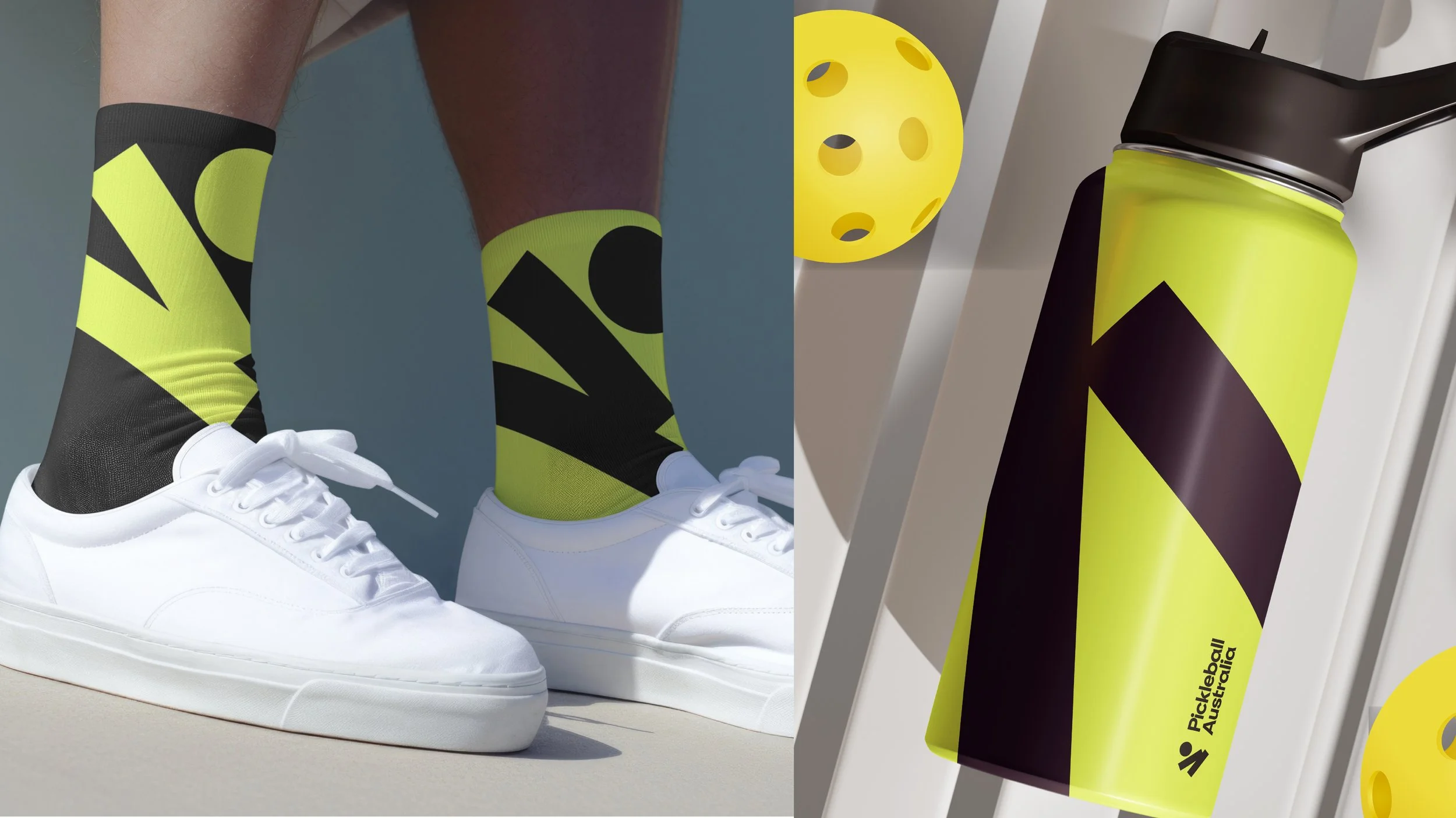
As the governing body, Pickleball Australia needed a brand that could unite a fast-moving community while celebrating the sport’s distinct personality: joyful, rebellious, inclusive and just a little bit quirky.
Our challenge was to capture the duality at the heart of pickleball, from casual rallies in driveways to national championships and the world stage. The new brand strategy clarified the organisation’s role as the pulse that powers pickleball, connecting players, clubs and competitions across the country.
Visually, the identity channels the rhythm and energy of play. Dynamic motion lines, expressive typography and bold colour bring the pulse to life, while a vibrant and accessible system reflects the community’s warmth and diversity.
More than a governing body, Pickleball Australia now stands as the spirited heartbeat of a growing movement, energising a sport that is as playful as it is competitive, and as inclusive as it is fast-paced.
Client
Pickleball Australia
We think business
Stakeholder engagement
We orchestrate brand
Brand strategy
Brand architecture
Brand identity
Brand guidelines
Brand application