Health Insurance that gets u.
Tired of health insurers treating you like a policy number? See-u shatters the mold with a bold, refreshingly simple approach to choosing the right coverage. Born from CUA Health Insurance, we retained its core values while championing a dynamic new identity. The name itself – “See-u” – is a powerful promise, bringing forward the phonetic letter sounds see-yoo and reflecting the personalised attention customers receive.
Challenging sector norms, the strategy positions the brand to meet customers where they are. Forget the complex plans, instead we focus on practical insurance that understands and evolves with you.
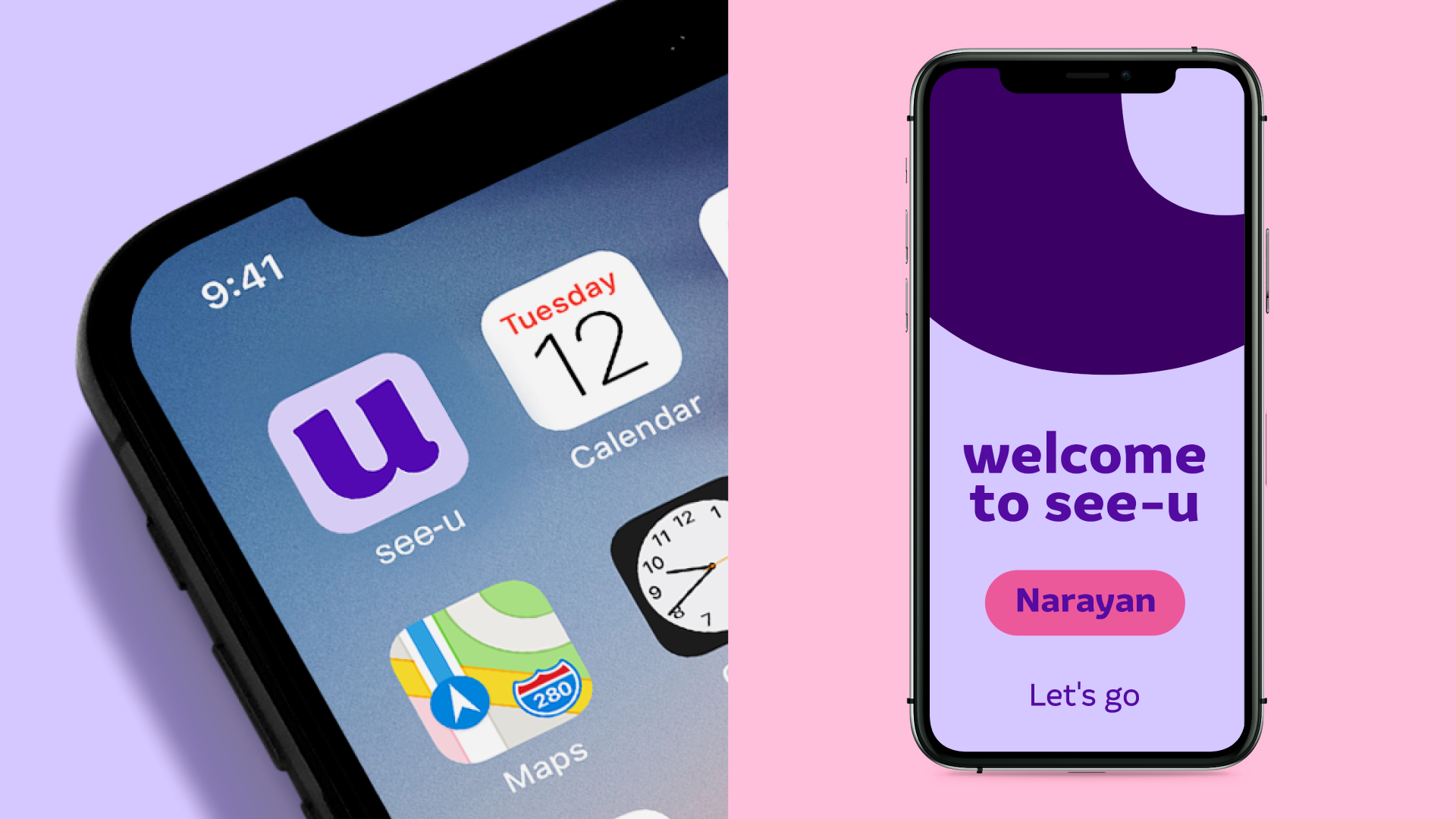
The visual identity responds through a disruptive visual aesthetic and distinctive photography style. The iconic ‘u’ is the signature brand asset, linking to the name and is a bold visual reminder of the brand’s promise.
Client
HBF
We think business
Stakeholder engagement
We orchestrate brand
Brand strategy, brand identity, brand voice, naming, key messages, brand guidelines, website consultation, brand application